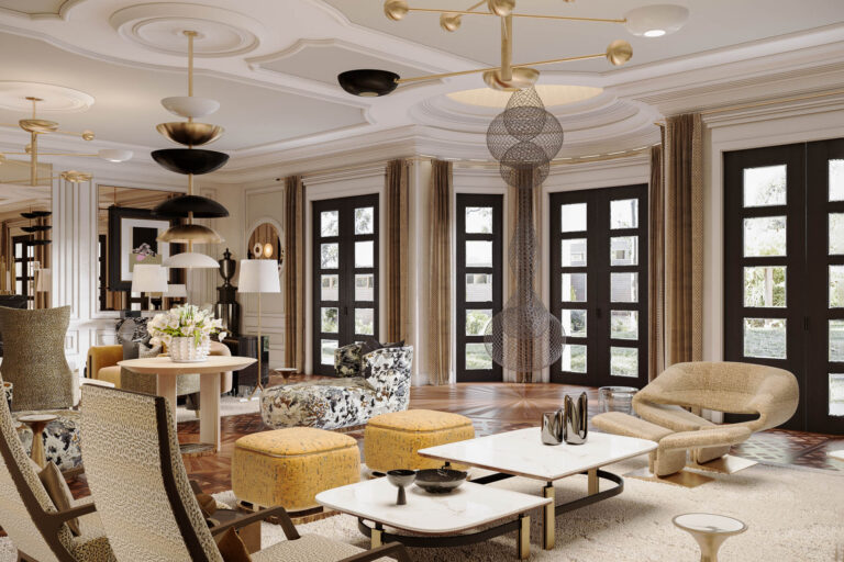
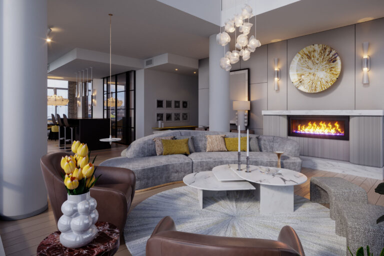
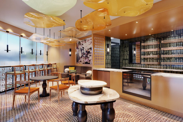
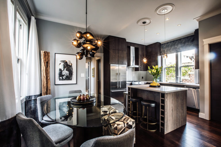
Interior Design + Graphic Design
Meade Design Group Inc. is a multidisciplinary design firm founded by Principal Designer, Iván Meade. Our company is based in Victoria on Vancouver Island and serves the local community as well as clients from mainland Canada, the United States, Australia, Mexico, Europe, and beyond.
The award-winning Meade Design Group team provides tailored interior design and graphic design solutions. Meade Design Group takes pride in our superior customer service from concept to delivery. Meade Design Group specialize in creating aesthetics that elegantly reflect our clients’ needs and personalities.
SURREAL REPRESENTATIONS – IVÁN MEADE COUTURE PILLOWCASES
Iván Meade’s new signature pillowcase collection is the culmination of 25 years in the design industry and an expression of his personal aesthetic of timeless European methodology with a sophisticated, modern edge. One of Meade’s fundamental design mantras is a phrase his mother would often use: “Find luxury in the things that you touch every day.” This deep-rooted philosophy is revealed in the sophisticated materials and patterns of the new line. “I have always had a passion for strange and unique forms, particularly those present in nature.” says Meade of his inspiration behind the collection.
For the latest release of his eponymous line of lifestyle products, Meade continues his personal narrative with a distinct je ne sais quoi.
Featured News and Events
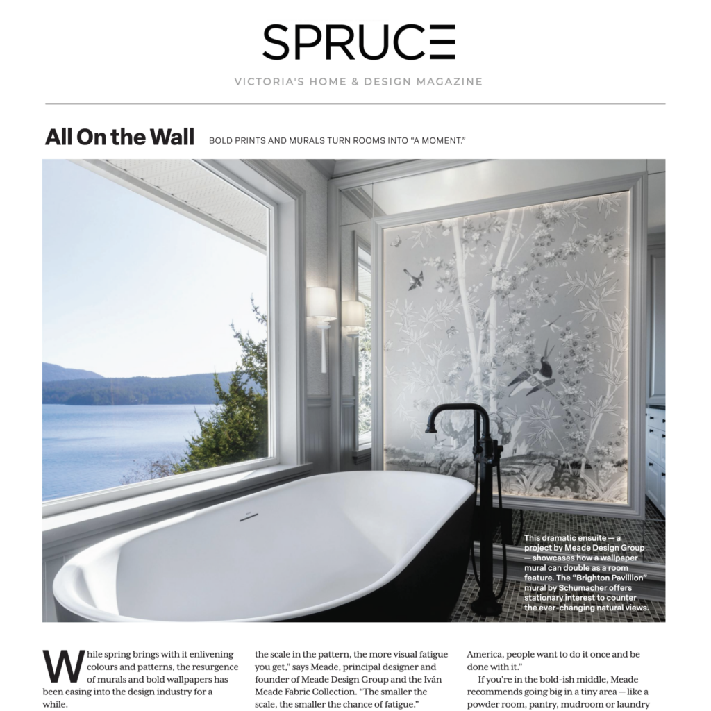
SPRUCE Magazine, ‘All On The Wall’ Wallpaper Article Featuring Meade Design Group
In SPRUCE Magazine's Spring Issue 'All On the Wall' wallpaper article, Meade Design Group's Maple Bay project showcase how a wallpaper mural can double as a room feature. Click here to read the article, page 58

Realtor.com ‘Who Is Tadao Ando?’ Article Featuring Iván Meade
In Realtor.com's 'Who Is Tadao Ando? The Pritzker Architect Attracting Celebrities (Such as Beyonce and Kanye) and Controversy' article, Iván Meade provides his thoughts on renowned Japanese architect, Tadao Ando. Click here to read the online article
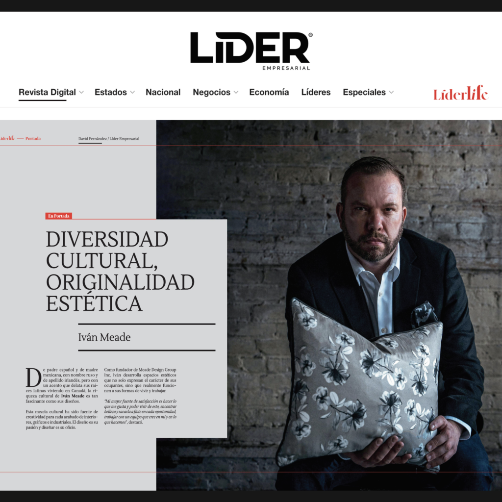
Libre Empresarial, San Luis Potosí’s Magazine, Iván Meade Featured Multi-Page Article
Iván Meade featured in a multi-page article within Liber Empresarial, San Luis Potosí's Magazine from Mexico, his hometown. The article titled 'Cultural Diversity, Aesthetic Originality' interviews Iván about his step-by-step creative design process. Click here to...